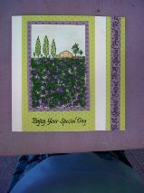
My demo in JAPONICA last week was all about scenes! This set has a mixture of scenes already made in it so it was very simple to use. (Scene-it Toppers). They were all gently coloured with soft pencils ( I use the Sakura ones as they blend really well) onto linen card for extra texture. I took my green shades from the paper I chose for my layout in this simple screen card. All the messages came from a set designed specially for landscape and seaside designs. A screen type card is a good way of using small scenes to incorporate into a bigger card. Larger scenes are much more difficult to create - so I don't do them much bigger - ever!
This stamp is just 1 large stamp -Tuscany - but I have covered the foreground with Lavender Magic Soft to make it look like a lavender field for a change! Usually this design is seen with sunflowers in the foreground!
Autumn Scene-It, was the set used for this design.
TOP TIP 1- Use the printed acetate sheet in the set to help create your scene by placing it over our prints to see if you have room for the next tree or house etc..
All the scene has been printed with black Versafine inkpad and then coloured with Tombow pens (on an acrylic block, ink being picked up using a brush and water).
TOP TIP 2- Look for opportunities or colour as often scenes can be drab wth lots of green and brown, such as the poppies in th foreground to add that touch of colour.
I have added Glossy Accent to the red petals to make them more prominent. The layering in red and then black makes these red poppie stand out even more too. Again the scene-it messages are perfect for this scene. "The Earth laughs in flowers!" The tiny decoupaged butterflies are from two accents in the message set and painted wth Tombow pens, just to add a tiny embellishment that is appropriate to the design.


Love the designs Jan,they're really different & original!! Sorry I missed the demo!!
ReplyDelete